How to Smartly Use Color in Your Compositions

Composition is defined as the artistic constitution of the parts of an image. In other words, it comes down to how you arrange the elements or pieces of your picture to get the most aesthetic and visually appealing results possible. One big component of that is using color as part of your composition.
For example, when’s the last time you paid attention to a picture specifically because of the vibrant and strong colors you saw in it? That happens all too often, proving how powerfully colors impact composition and how relatively easy it is to make it work for you.

There are a few, different ways by which you can make color work for you in your shots.
It’s a Mood Setter
Ever notice how your mood changes based on the image you’re viewing? It can be subtle at times, but it can also be very blatant. Sunsets are relaxing while looking at pictures of amazing panoramas can be downright inspiring.
Depending on the color you use, you can influence your viewer’s mood.
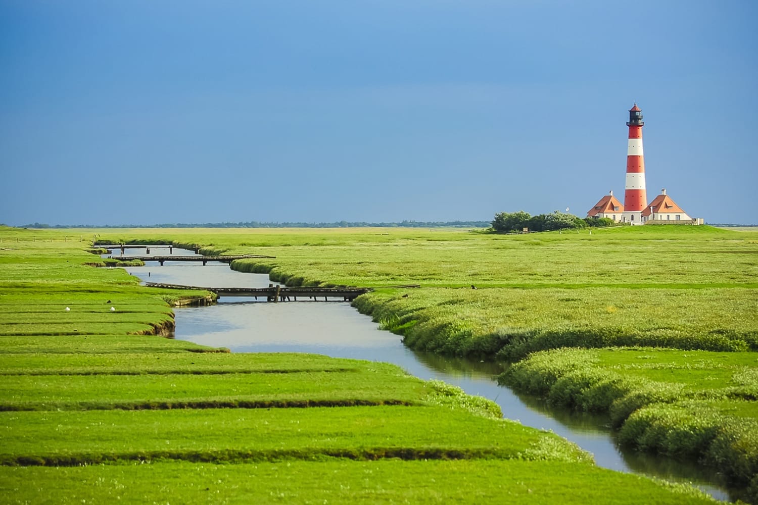
Let’s go with the color blue. This cool and soft color evokes calm and soothing feelings. If you’re looking to create an image that makes people feel serene and peaceful, be sure to include a blue stream, lake or other body of water in the composition.
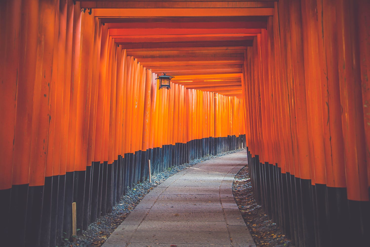
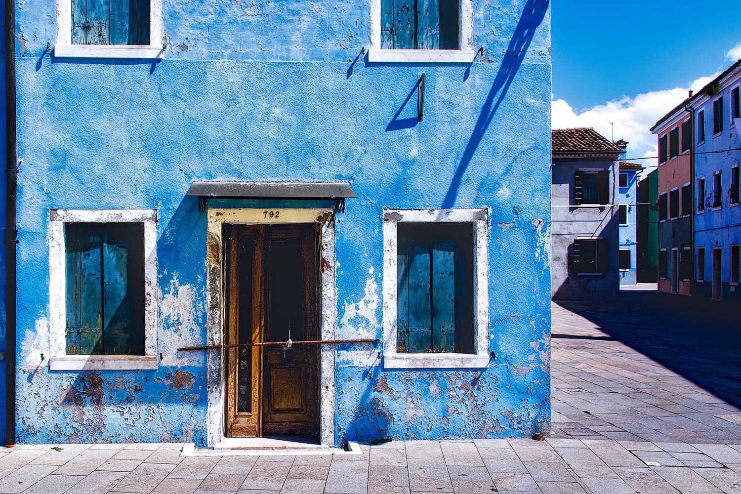
On the other end of the color spectrum lie the more passionate, warm colors like red, orange and yellow. These colors tend to create feelings of comfort based on how we experience them in nature (think of a roaring fire when it’s a cold night, for instance!).
So, to create a warm and comfortable mood in your shots, use these colors for elements like sunsets, flames, beaches, etc.
Subtlety and Pastels
You can use pastel colors in your shots to use color in a subtler way that’s almost approaching a monochromatic scheme. The key here is to step away from the aforementioned stronger and bolder colors like blue blues and red reds. Think of the colors that you see all around you in nature when it’s a cloudier and duller day. This subdued color scheme is what you want to go for in your shots, too.
When you shoot scenes on cloudier days, you’ll get a lot of pastel hues in your pictures. This soft light and the pastels are ideal for subjects like portraitures, still life, and even flowers. Essentially, they’re good for scenes where too much contrast would be a problem.
The Importance of Balance
Balance is so important when working with colors in composition. Everything in moderation; you don’t want to overpower anything in your shots.

Ever glance at a color wheel before? It shows the relationships between different colors, which is instrumental to how you can smartly use them in compositions. The colors that sit close to each other on the wheel are those that complement each other (hence, their proximity).
This is a hint: Using those colors close to each other on the wheel will create nice-looking and well-balanced pictures.
Let’s go to an example.
Blues and greens sit next to each other on the wheel. Therefore, a shot that expresses fine balance would be something like a babbling brook (blue) that courses through a serene forest or meadow (green). Not only is this well-balanced, but it’s a shot that also relaxes your viewers.
Creating Specific Effects
Colors in your shots can also work well as cues—in the sense that they help to draw the viewer’s attention to a specific part of the frame. Naturally, contrast will be a big part of this equation, too.
With some thoughtful planning, you can draw attention to the smallest elements in your shots with only a perfectly placed bit of striking color. For instance, a child in a bright blue vest walking in a pale-yellow corn field. In this example, the corn field is a lot more subdued in contrast with the very blue vest of the child.
Using color like this also makes the point once more about how subtlety can be a big game-changer overall in the shot.
Natural Light for Color Effects
Depending on the exact time of the day that you shoot, you can use the natural light to create color composition in your images. So far, we’ve talked mainly about taking shots of objects that boast a certain color to compose your shots. Now, we’re switching gears and touching on the light within color.
Two of the most potent times in any given day for using color in light are early morning and the evening. Think of it as dawn and dusk. In the early morning, there’s a small window of time where the light is generally a cool, soft blue. There’s even a specific name for this type of photography: blue hour photography.
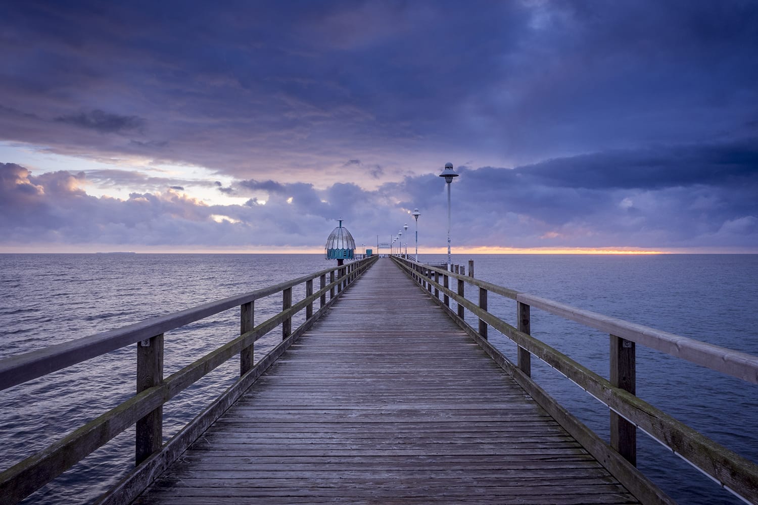
Here, you don’t have to do any work in finding objects that are striking in color because nature just bathes everything in its magical glow, doing the work for you. A good shot for this time of day could be the skyline of a harbor or a waterfront downtown section of the city, where the blue light illuminates everything in its path.

Juxtapose this with sunset, where the natural light is literally ablaze with reds, oranges and yellows. Right after the crack of dawn and right before sunrise, you’ll see all of these amazing colors in the environment around you, making it perfect for a specific composition shot. Think of something as simple and effective as a mountain during sunset that’s giving off all these rich, warm colors!
Using Color the Right Way
As you can see, there are numerous ways for you to beautifully integrate color into your photographs. Color doesn’t just add a nice splash of vibrancy to your images; it adds helpful compositional elements that optimize your snapshots.
Color is quite versatile. You can use it in subtle ways, such as with pastel colors, or you can use it in louder ways, like aggressive touches of bold colors to make something stand out on purpose for contrast’s sake.
Overall, you can’t go wrong with color in composition, so experiment more with this in your shots, and see the nice results you’ll get.
About the Author: Marc Schenker
 Marc is a copywriter and content marketer who covered photography. These days, he runs The Glorious Company, a content marketing agency.